rumprustler Posted March 23, 2022 Share Posted March 23, 2022 hi , just got 1st glance at the new screen set up & the thing that jumps out right away is the selection block are too big and blocking most of the background art this will really ruin the Event backgrounds artwork ; what will be the point of all the hard work you guy put into the event screens if we can't see it the blocks should be minimized much smaller closer to the sides and bottom so the art sands thru or added as a pop up to be selected like the new boyfriend eye hide THANK's for hearing me out & have a great day yours truly Rumprustler 1 Link to comment Share on other sites More sharing options...
Moderator Zamioc Yuki Posted March 23, 2022 Moderator Share Posted March 23, 2022 I agree for the event back ground that sucks. On the other hand it is now better to navigate when you're playing on your phone... Link to comment Share on other sites More sharing options...
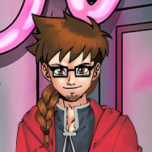
Eckos Posted March 23, 2022 Share Posted March 23, 2022 In terms of overview and order the new view is certainly better, but like rumprustler I too think both the buttons on the left side as well as those on the right are too big and take up too much space. There are also some infos missing now that we had before like your current league and current placement being visible on the Tower of Fame button or adjacent to it or on the money from harem button the countdown when the next sum of money arrives is gone. It's weird that there was more information at one glance available when the buttons were smaller and unordered around the GUI than now with bigger buttons. If they could tweak the button sizes and bring back the old additional info I guess the new GUI would be almost completely superior to the old one. The idea of displaying a single guy prominently is a neat little feature, choosing a different one also helps me distinguish between the main server and Nutaku account, yet I foresee that it may mean more work for the forum moderators when there are screenshots popping up of players who have chosen guys not in their base pose. 😅 1 Link to comment Share on other sites More sharing options...
erhuty Posted March 23, 2022 Share Posted March 23, 2022 Have somebody test new 'design' with non-standard (increased) default font size? 😠 Link to comment Share on other sites More sharing options...
robroy35 Posted March 23, 2022 Share Posted March 23, 2022 sorry but to bad to see something on a smartphone and blur on a big screen give me headeak (sorry but my english is not top) 1 Link to comment Share on other sites More sharing options...
Moderator Oliver66 Posted March 23, 2022 Moderator Share Posted March 23, 2022 If you hide the guy it at least removed the blur effect Link to comment Share on other sites More sharing options...
Marc2 Posted March 23, 2022 Share Posted March 23, 2022 Before it was better. Link to comment Share on other sites More sharing options...
Wolfaolchu Posted March 23, 2022 Share Posted March 23, 2022 Yeah I really don't like the new layout. How do you get rid of or change the guy? Link to comment Share on other sites More sharing options...
panluxifer Posted March 24, 2022 Share Posted March 24, 2022 Hi, I hate the new screen display. Previously it was easier to navigate as there was a spatial component to the game i.e. the background had some story to tell, like one place was the shop, another was the disco etc. Previously there was a sense of traveling from one place to another, but now there are just buttons which I have to remember. I mean I already did not use the navigation on the top right corner before and now I am forced to do so. Please keep both options open for everyone; if someone wants a quicker way then they have the navigation button on the right top corner and if someone, like me, likes the background story and a sense of navigation and travel, then they can do so as well; then let the players choose by having both options open as before. Link to comment Share on other sites More sharing options...
Moderator Oliver66 Posted March 24, 2022 Moderator Share Posted March 24, 2022 5 hours ago, Wolfaolchu said: Yeah I really don't like the new layout. How do you get rid of or change the guy? Bottom of the screen pretty much in the centre there are 2 icons. Left on looks kinda like an eye with a / through it. If you click on it the guy gets hidden and and background comes into focus. The button on the right looks like a pencil lets you pick the guy/pose you want to use. 1 Link to comment Share on other sites More sharing options...
Recommended Posts
Please sign in to comment
You will be able to leave a comment after signing in
Sign In Now