Search the Community
Showing results for tags 'appearance'.
Found 1 result
-
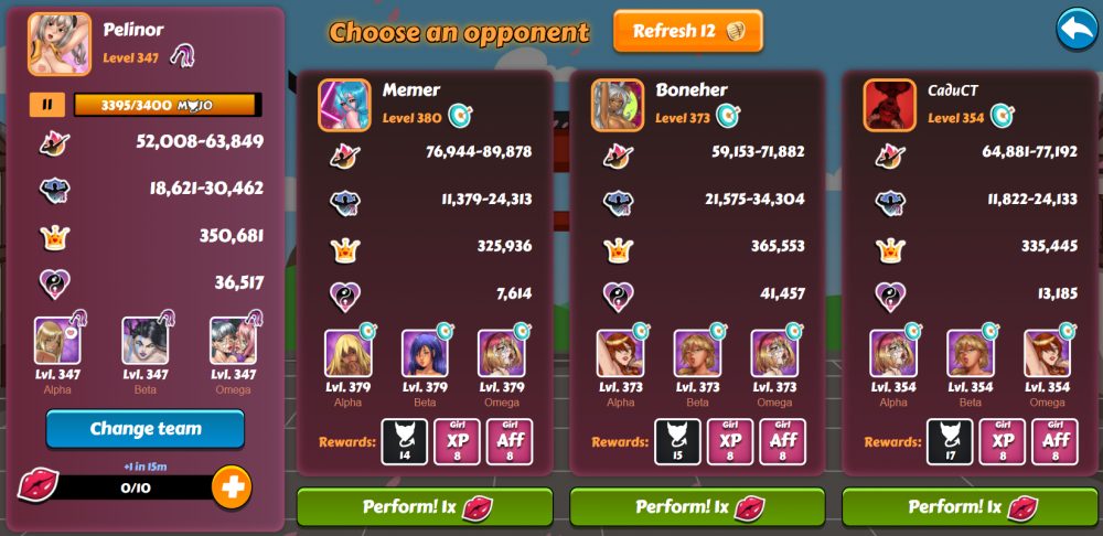
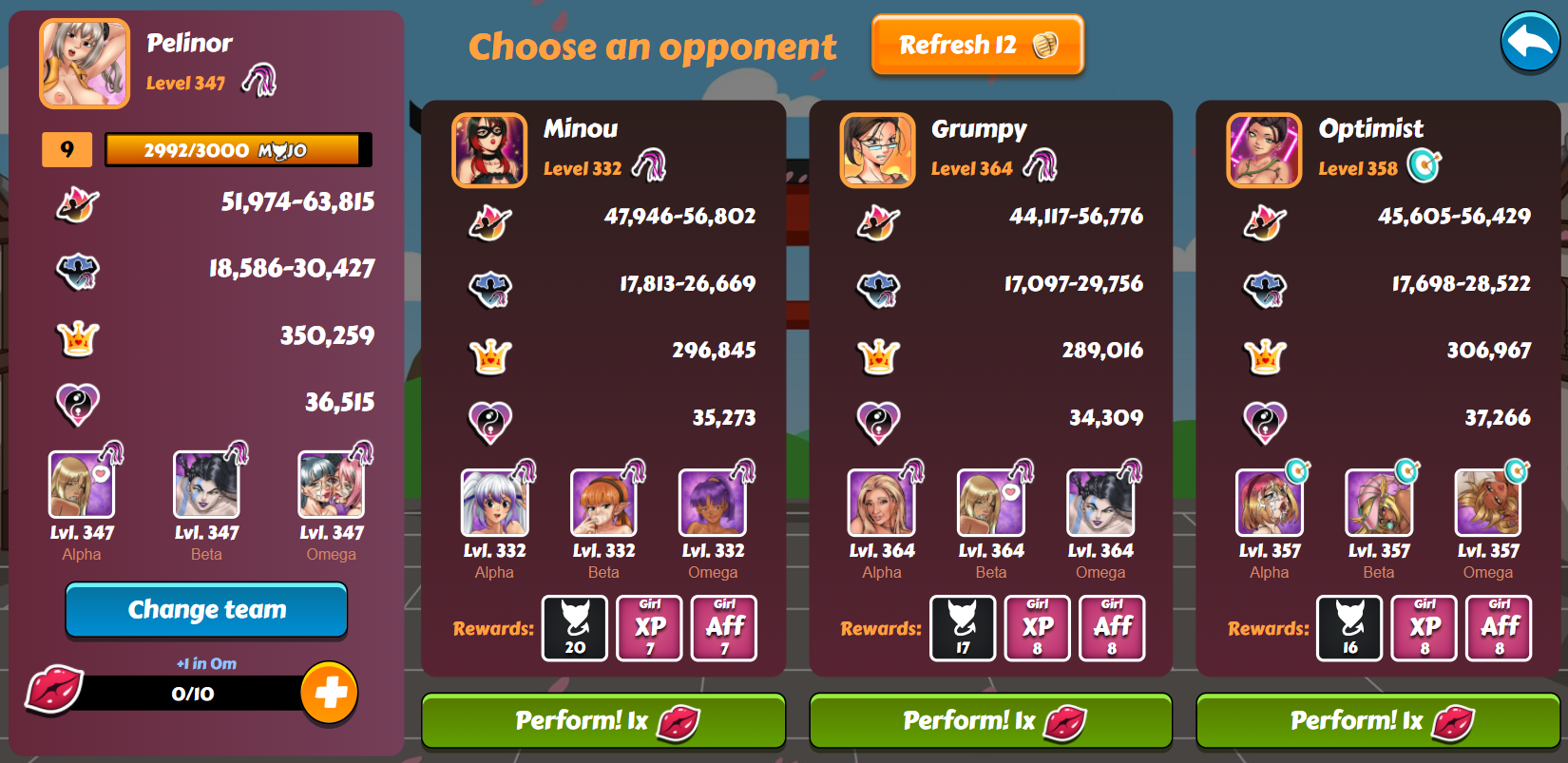
This Seasons screen appears drab and unfinished compared to the other game sections, such as the ToF or Clubs. I would suggest adding a box-shadow to the player and opponents panels and a text-shadow to give it a more finished appearance. Something like this, perhaps?