Search the Community
Showing results for tags 'facepalm'.
Found 4 results
-
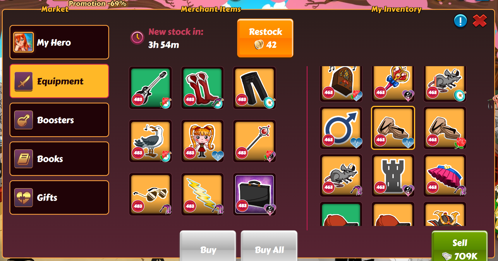
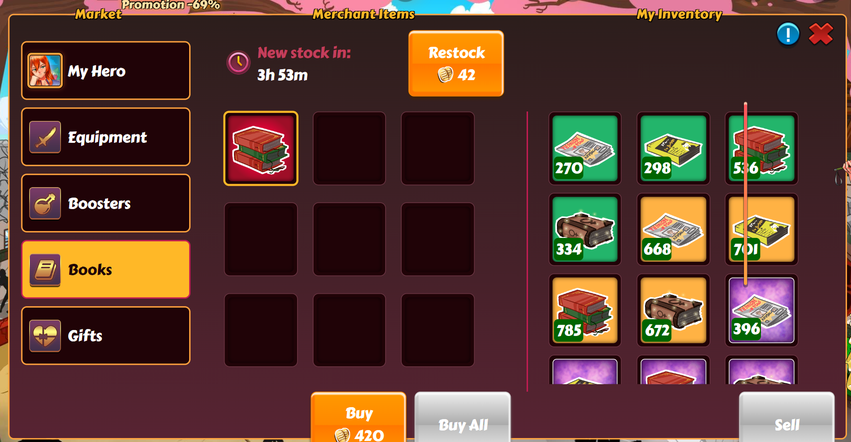
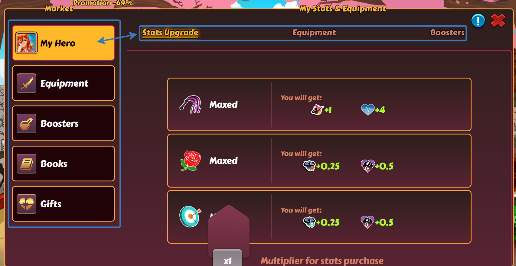
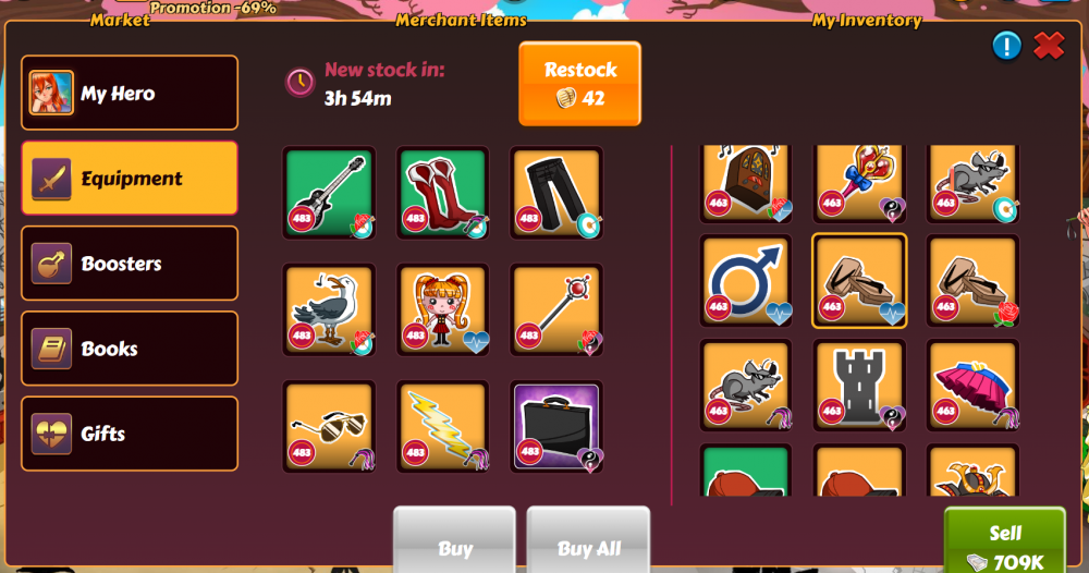
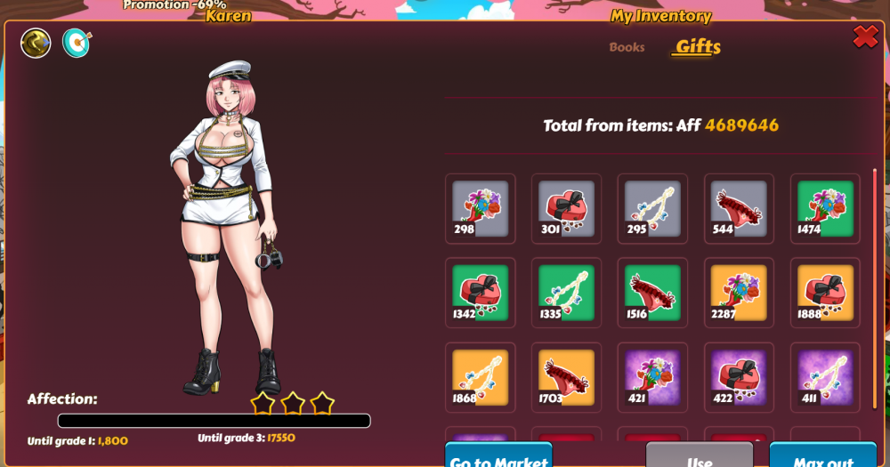
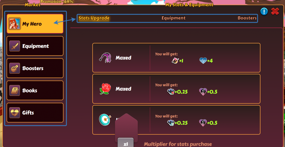
I haven't spoken before, nor do I hope to speak again. But this recent update was the last drop. Kinkoid, your new Market design is a goddamn abomination. An absolute worst UI/UX decision I have ever witnessed in my entire life, in any app or web site. It can be used as a guide to "How NOT To Design Your Shit". It's so terrible that I already don't want to use it anymore. But more than that, I am really surprised by the reaction of the people here on forum. I get it when Mods are praising the new changes — what else could they do? But you, guys... You have just been given a pile of shit with a small cherry on top and everyone decided to single out that cherry, completely ignoring the fact that nothing else matters as long as it's covered with dogshit all over. You praise the "Buy All" button, really? "Ninth slot"? For real? ———————————————————————————————— Okay, let's go over the details. First of all, there was no need to separate buying from using the items. Why not go further and separate buying from selling? Because that's what we all want, right? A hundred different tabs with slightly different purposes. And we can't even see which item is going to be replaced by the new one we found on the buying page. Oh, and take a look at these menus: one takes 20% of the screen, the other is barely noticeable, small and without any visual hints. I bet most of the players didn't even notice the tabs in the top row at first (which is, by the way, only accessible from the "My Hero" frame): Not only we have to go to Harem in order to upgrade/level up, we can't even do it in batches. Even upgrading the girls wasn't much of a struggle before, because you could just open each of them in a new tab by a single press of the mouse wheel under the avatar. Now you can't even scroll between the girls, you have to go back to the main Harem page every time you're done with upgrading. So I guess 99% of the players (and 100% of the devs) only have 10-15 girls in their harem to justify that? Or was all of that just to make these "Spend 90 millions" tasks ever harder? If I want to struggle with tedious tasks, I just go to work — at least that one pays in return. Tedious, tedious, tedious. Looks like that is the core principle of their development strategy. To make players suffer with simple, basic stuff. Almost every change or a new feature introduces more of the annoying grinding. Annoyance, frustration, irritation, exhaustion, sometimes even anger — everything, but joy. Not a single bright thing in this unstoppable stream of updates. But we are wandering off, let's get back to details. You know how everything is stacked in groups of four, right? Books and gifts, it's all in "fours": four grey types, four of green ones, four of yellow and so on. And it was displayed in groups of four. Even in Daily Goals or various events selling was in "fours" — we had a very useful visible cue in Markets for that. But what do we have now? Three columns in the store and five in the Harem page, where you can actually use said items. That is plain trolling from Kinkoid. Because it looks so convenient, right? Just look at this perfection, what could be better? It looks like these old websites from the '00s displayed on the small screens of the old JAVA phones with physical buttons. Or on the earliest smartphones. Long before adapting to mobile screens was even considered by the web developers. Our memory was positional. We didn't need to look for exact items, because we always knew that second green gift from the left is "+60 Aff" and first yellow from the right could be safely rounded up to "+500 Aff". What do we have now? Two different unfitting tables with three and five columns each. That is devs' trolling, if I ever seen one. Not even speaking about the vast unused space in the said upgrade page. Furthermore, we now have these gigantic icons with a tiny border around the one in focus. Not only that, it also has the same color hue as the yellow items. Can you at the first glance tell which item is highlighted on this screenshot? Thought so. And don't even get me started on their inability to adapt different browsers, even if they are based on Chromium (renders at least one event unfinishable in my browser). ———————————————————————————————— People saying things like "Well, maybe that was inevitable with all the legacy code they have" don't understand how Web development works; don't understand that back-end can be worked on independently, and there was absolutely no need to change the UI so drastically. Before you start busting out on me, I've been here for almost five years, for the most of this project lifetime. And yes, it was better before. At the very least it was USABLE. Some tedious things here and there could've been fixed with scripts, but overall it was an OK experience. And now it's just "Oh my God, do I have to do this again?..". I have been silent before. I have been silent when they started doing more changes in order to make people pay more money. I have been silent when they first removed seconds in the main page Collect timer (understandable), then removed said timers entirely. Just to make people click the yellow "Collect all" button more frequently, even if there's just another ten minutes before the new 500k income becomes ready to collect. To make people click on that button again, waste away their Kobans even more and then eventually seeing a need to pay the real money for that. Because no one in their right mind would load Harem with hundreds and hundreds of girls and see how many of these rewards are gonna be ready to collect soon. I have been silent when they introduced Mythic girls — you can get one shard for a hundred of tries and there's no guarantee that you will get any more in the next hundred. Even if you do 50 batches at the start of the new shards drop. Because being money grabbers is not even frowned upon in our modern society. But this was the last drop. You started this "Let's make the ugliest design" challenge a while ago and I don't suppose it will stop here. Doesn't need to — it's already unusable and completely devoid of joy and entertainment. All right, I'm done, where's my *facepalm* emoji?

-
Vu le pavé qui va suivre , pardonnez-moi pour la mise en page . Amusez-vous bien ! @[CNO] Jacky Choun et ses parties de cache-cache et de chat-perché avec son avatar pour commencer . @Roi Des Pervers ? et l'image avant le consentement : @goku1 @fabian60 et l'inscription aux ligues :

-