entwine
-
Posts
16 -
Joined
-
Last visited
entwine's Achievements
")
Newbie (1/14)
6
Reputation
-
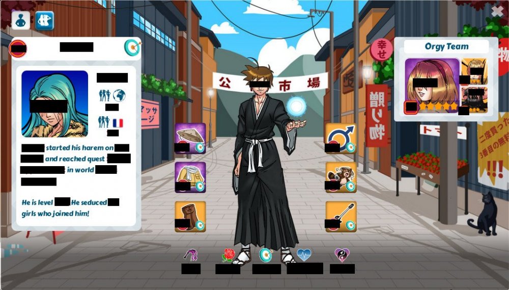
❤️ Botanist Murakawa Hentai heroes ID: 252531
-
entwine changed their profile photo
-
❤️ Hentai Heroes ID: 252531
-
❤️Hentai Heroes ID: 252531
-
😮 Hentai Heroes: 252531
-
I'd be one of those bad guys she catches Hentai Heroes 252531
-
fuck: Delicia marry: Desdemona friendzone: Chamelea Hentai Heroes: 252531
-
into Tabatha or 'harpy girl' from Splatters Archipelago Hentai Heroes ID 252531
-
Lemia Hentai Heroes ID: 252531
-
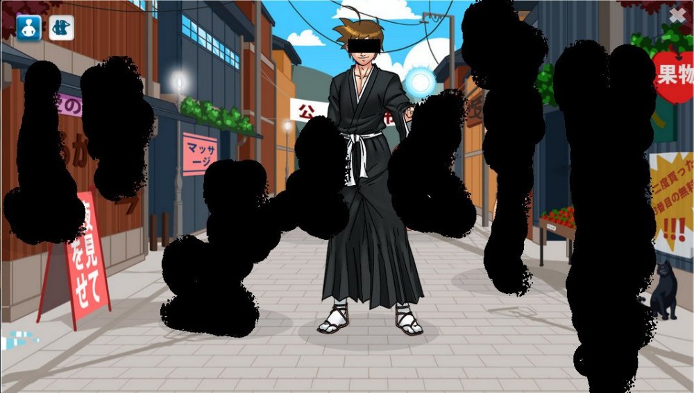
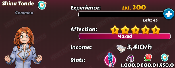
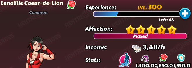
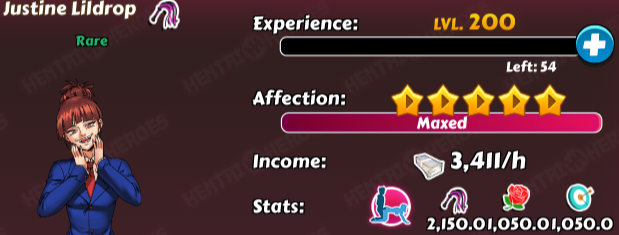
Maybe you're right - this happens when I open a second window with other stuff and placing them parallel. But this doesn't explain why the other scroll bars look fine. Have you got any idea? I think something is wrong with this one and it's because settings page isn't often visited so no one reported this. IMO aspect ratio doesn't influence into the second issue. Anyway, looks bad on PC and smartphone (even on full screen). Another example: As you see there is a lot of spacing between 'Stats:' and 'favorite position' so they should increase the spacing between these numbers or just remove '.0' at the end of the value of stats.
-
It occurs when you go to the club via the profile page in contests or arena and then clicking the red close button. from dev-tools:

-
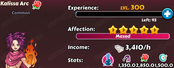
The scroll bar on the settings page doesn't fit the overall style: There are too small spacing between stats on the harem page (occurs when a girl's level is quite high and stats are above 1000): Yaa I know it's not important for devs... maybe someday...


-
I do not know if this is a bug, but it occurs when I go to the settings page. Chromium 74.0.3729.108 built on Debian 10.0, running on Debian 10.0

-
I've just won Toshiko (last amount of shards) and she should be the last girl in my harem when I use sort by "date recruited". I think she is at the place when I've won her first shards.

-
OK, I changed it.
-
When I view the profile of other players and switch between "hero" and "girls" tabs - the background image doesn't refresh. PS. sorry for my english - I still learning...